The most common visual element of the ST brand is the logo. Variations in the logo allow for horizontal and vertical use. These are the approved and official logos to be used consistently and faithfully in all agency communications. The Sound Transit logo paired with tagline is used only for marketing and rider information materials.
The agency logo consists of the ST mark (symbol) and the agency name. The horizontal logo is the preferred logo for most applications. The vertical logo is used when the horizontal version is impractical due to space limitations.
Horizontal logo
PNG files
EPS files
Vertical logo
PNG files
EPS files
Logo color usage
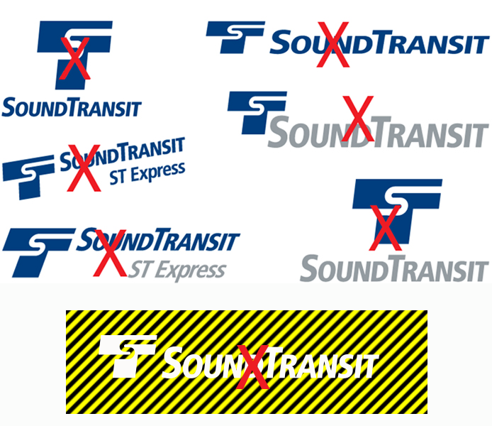
The logo is designed for a high-contrast presentation. If the logo sits on a white field, it should be black or "Dark Wave" (dark blue) in color. If the logo sits on a black or dark background, it should be reversed out to white. Avoid placing logo on patterns, stripes or visually busy backgrounds.
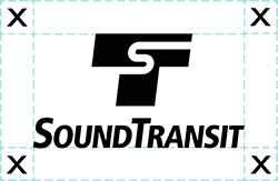
Logo clear space
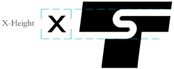
The Sound Transit logo has a visual living space that it needs to maintain readability and integrity. The minimum space required for clear space is defined by the measurement "X", which is derived from the height of the "S" in the ST mark.
Improper use of logo
The Sound Transit logo should never be enhanced or changed. Do not elongate, compress, stretch, italicize or place the logo at an angle. The relationship between the ST mark and the typography of the agency name must always remain the same and should not be shown separate from each other.


